Table of contents
Introducing Color Palettes
A well-curated color palette can be fundamental to your frontend aesthetic. It can set the tone for your website, influences the users mood, and reinforces branding. Typically, designers or developers select a color palette containing primary, secondary, and tertiary color hues, each with various shades.
However, the traditional approach of manually defining each color variant can be tedious and lack flexibility. This highlights the main hurdle - that traditional palettes are not easily extensible when design requirements change. The need for a more efficient way of managing color palettes led me to explore the capabilities of the CSS color-mix() function.
The Power of CSS color-mix()
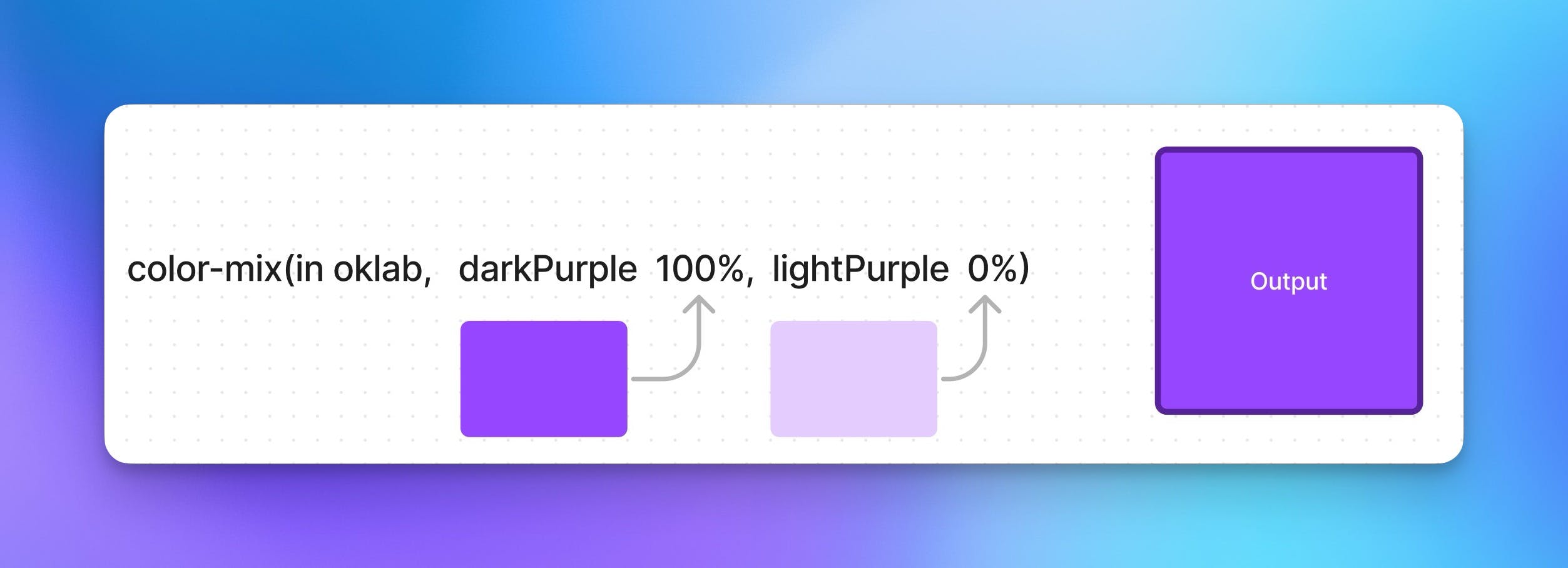
With the color-mix() function, we can select two colors (blue and yellow) to "mix," which produces green! The real power of color-mix() is it allows us to decide how much of each color we want to mix changing the outputting color slightly. Let's take a look at the example below:

Let's break down how this example is working. Our color-mix function takes in at least three parameters.
The first is the interpolation method (required) this is the the color space used for mixing our colors.
The second is our first color we are mixing (required).
The third (not required) is how much of that color to use.
The fourth is the second color to mix (required).
The fifth (not required) is the amount of the second color to use.
The output is the result of mixing 100%of the dark purple, with 0% of the light purple.
In other words, think of the color-mix function as a beaker we'll use to mix two colors. We can add a little or as much of each color as we want. The resulting color depends on how much of each color we mix.

However, using color-mix requires us to change our mental model when thinking about color palettes. With color-mix, we're no longer constrained to the typical color palette values; purple-50, purple-100, purple-200 ... . Instead, we're defining color ranges with upper and lower bounds, which offer virtually infinite color variations that lie within these boundaries.
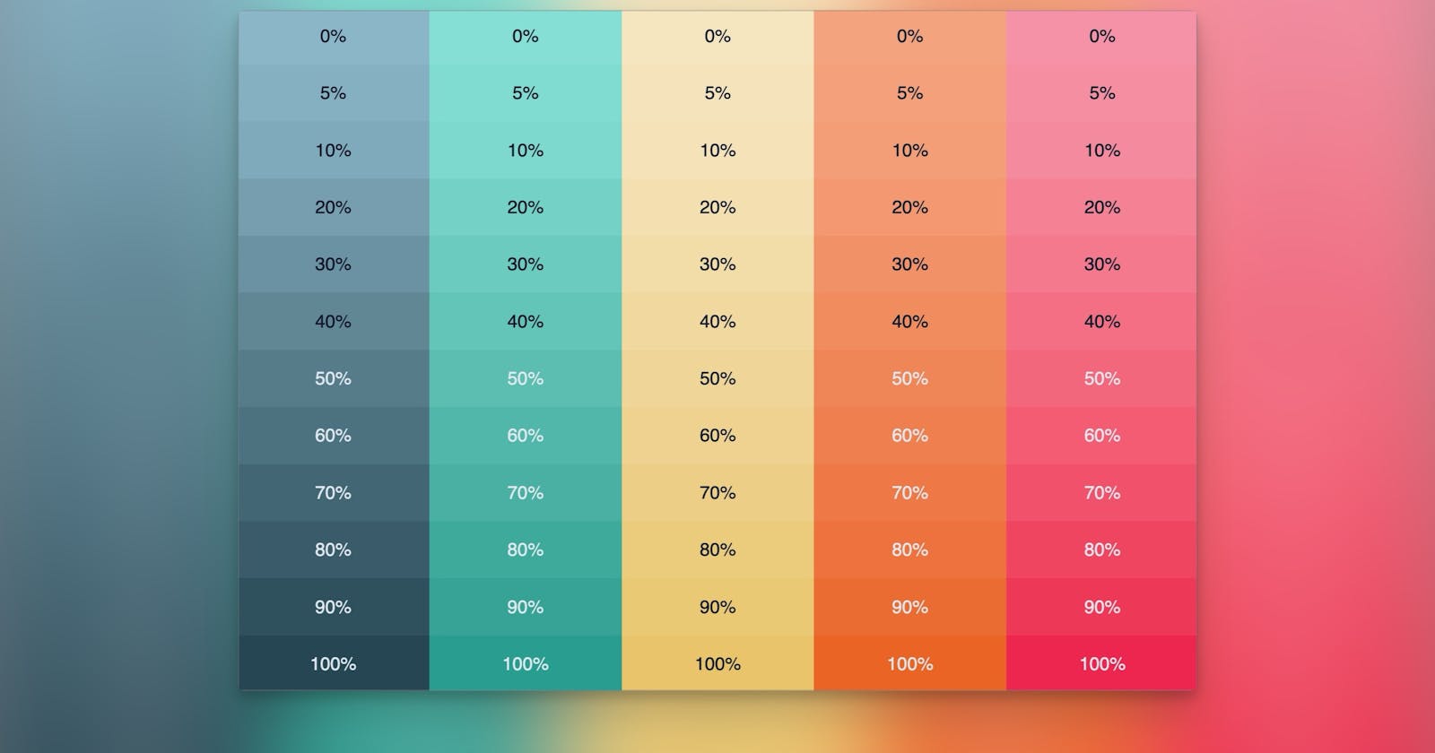
Let's create our first color palette using color-mix, our upper bound color (darker color) will be a dark aqua, and our lower bound color (lighter color) is a light aqua.
<div>
  <div class="container" style="--weight: 0%"></div>
  <div class="container" style="--weight: 5%"></div>
  <div class="container" style="--weight: 10%"></div>
  <div class="container" style="--weight: 20%"></div>
  <div class="container" style="--weight: 30%"></div>
  <div class="container" style="--weight: 40%"></div>
  <div class="container" style="--weight: 50%"></div>
  <div class="container" style="--weight: 60%"></div>
  <div class="container" style="--weight: 70%"></div>
  <div class="container" style="--weight: 80%"></div>
  <div class="container" style="--weight: 90%"></div>
  <div class="container" style="--weight: 100%"></div>
</div>
Each div represents a point along our color scale, with --weight going from 0% to 100% in 5-10% increments.
Now, let's look at our CSS. Here we're setting the background-color of our .container class using the color-mix() function.
.container {
  background: color-mix(in srgb, #299D8F, #85DFD4 var(--weight, 100%));
}
The color-mix() function is taking in two colors and the --weight custom property. The weight represents the proportion of the second color in the mix. As a result, we get a smooth gradation from our upper bound color to our lower bound color.
This example results in a flexible color palette where we can easily create and visualize different color gradations using the color-mix() function. This is the power and flexibility we gain by leveraging CSS color-mix() for scalable color palettes.

Visualizing Color-Mix as a Gradient
A useful way to think about the power of color-mix() is to visualize it as a gradient palette. This palette starts with the upper bound color on one end and transitions smoothly to the lower bound color on the other end. Our --weight custom property effectively lets us pick any point along this gradient palette, we now have an extensive range of colors to choose from.
Here's an example of how you might represent this using CSS gradient.

In the .gradient class, we have a gradient that represents our full color-mix() palette, transitioning from our upper color #299D8F to our lower color #85DFD4.
In the .gradient-stops class, we have indicated where our pre-defined --weight values would fall along the gradient. It provides a visual representation of where you might land on the gradient for each of the percentages used.
By visualizing color-mix() as a palette of gradient stops, we can better understand how --weight allows the selection of any shade between two colors. It extends our color palette enormously, providing a significant boost to the flexibility and scalability of our design.
Translating the Palette Into Actual Design Components
Now that we have an understanding of how color-mix works, lets put it to use. The dynamic nature of our CSS color-mix() palette enables us to easily apply it to any components.
For instance, consider a reusable container component designed to allow a flexible background color. Instead of defining a static set of colored containers, we harness the power of CSS color-mix() to create containers where we can adjust the color by changing the --weight variable:
<div class="container-aqua" style="--weight: 20%">
  <h2>Lorem, ipsum dolor.</h2>
  <p>Lorem ipsum dolor sit amet, consectetur adipisicing</p>
</div>
And the css:
.container-aqua {
  background: color-mix(in srgb, #299D8F, #85DFD4 var(--weight));
}
By changing the --weight inline style on each container div, we can change the background color along our defined color gradient. This approach provides us with the versatility to set numerous color variations just by adjusting one CSS custom property.

Extending the Palette to Font Colors
Lets take this one step further and extend our scalable color palette to font colors as well. This will ensure that the text within our containers remains readable regardless of the background color. Our HTML remains the same, we'll need to update our css: (⚠️ We'll need a small bit of JavaScript to help add a custom variable, more on this later!)
.container {
  background: color-mix(in srgb, #299D8F, #85DFD4 var(--weight, 100%));

  color: color-mix(in srgb, #E2E8F0, #0F172A var(--ft-weight, 0%));
}
Let's break this down:
We use color-mix to determine our font color.
The percentage of color used will be determined by our --ft-weight variable, if none is provided the 0% fallback value is used
In order to make this dynamic we'll need a bit of Javascript, but first lets break down what we are trying to accomplish.
1. Element Selection: The querySelectorAll() function collects all div elements with our .container-aqua class.
2. Iteration Over Elements: We loop through the elements and do the following:
3. Acquire Weight: We use the getComputedStyle() method to get the current value of the --weight CSS property.
4. Check Weight Existence: If a --weight style exists:
5. Convert Weight to Number: We take the --weight value, strip off the '%', and convert the remaining string to a number.
6. Determine Font Weight: If the weight is less than 50, we set --ft-weight to 100% (dark font color), otherwise, we set it to 0% (light font color). This ensures high contrast for readability.
This JavaScript snippet automates the changing of the font color based on the --weight, ensuring contrast for readability even as the color-mix() varies the background color. 🎩 🐰
Here's the JS Code:
// Select all elements with class 'container-aqua'
const elements = document.querySelectorAll(".container-aqua");

elements.forEach(element => {
    // Get the --weight style
    const weightStyle = getComputedStyle(element).getPropertyValue('--weight');

    // If --weight style exists
    if (weightStyle) {
        // Remove the '%' and convert to a number
        let weight = Number(weightStyle.replace('%', ''));

        // Check the weight and set --ft-weight accordingly
        if (!isNaN(weight) && weight < 50){
            element.style.setProperty("--ft-weight", "100%");
        } else if (!isNaN(weight)) {
            element.style.setProperty("--ft-weight", "0%");
        }
    }
});
Tying It All Together: The Complete Picture

Let's demonstrate how we can utilize all these elements in creating responsive designs.
Consider a scenario where we want to have a container with a heading and a paragraph tag. We can easily change the background and font color, by using our --weight inline style:
<section>
  <div class="container-aqua" style="--weight: 100%">
    <h2>Lorem, ipsum dolor.</h2>
    <p>Lorem ipsum dolor sit amet, consectetur adipisicing elit.</p>
  </div>
</section>
Our JavaScript code will automatically adjust the --ft-weight and the font color to complement the background color we've set through --weight.
In conclusion, using the CSS color-mix() function in conjunction with JavaScript, we've created an incredibly flexible, adaptive color system. Our approach allows us to control and modify the color palette on the fly, giving us a practically infinite shades just by changing the percentage weight - instead of adding more colors to our palette.
Not only does this method significantly enhance scalability and maintainability, but it also ensures that our design remains accessible with high contrast between text and their backgrounds.

