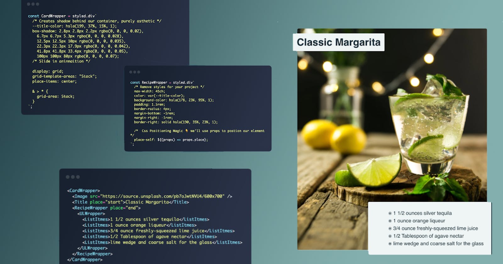
Creating A Reusable, Flexible, Image Card with React and Styled Components.
A bit of House Keeping: If you're following along you'll need to spin up a react app and install styled-components. code-sandbox

Structuring our Component.
We'll start with laying out the structure of our components, we'll then move on to building our grid interface, lastly, we'll add in our elements.
Structuring our Layout
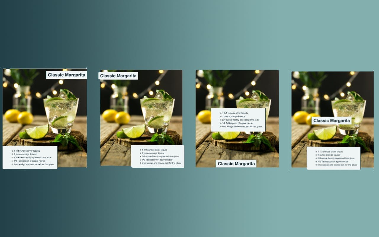
In order for our component to be flexible and most importantly reusable, there are a few things we should consider. Let's start with our layout and what we want to accomplish. Our parent wrapper should display:
- Any Image
- A Title (With the ability to choose its location within its parent)
- A Description (With the ability to choose its location within its parent)
The children components should have the ability to place themselves within the parent freely as pictured below. The structure will make our components flexible and reusable.
Creating our Components.
Let's create the parent<Wrapper /> component with styled-components. Lets walk through the code.
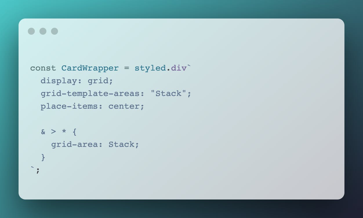
display:grid-Setting display grid doesn't affect the behavior of the wrapper, but instead makes any direct childrengrid-items. This behavior will let our children move around its parent container without the need for reaching forposition:absolute.grid-template-areas:"Stack"-A few things to note here,grid-template-areas:"Stack"is essentially creating one grid area and naming it Stack. We will eventually place all of our children in this grid-area. Notice that Stack is in quotation marks, when we assign our children to this grid area we have to leave out the quotes.place-items:center: center-This be the default for our children, they will be positioned in the center of thegrid-area. If you have more than one child in our wrapper they will be layered on top of each other by dom order.& > * { grid-area: Stack }- This selector applies styles to all direct children of the parent. This declaration puts all of the children inside of our
Stackgrid-area.
Now that we've set up our <Wrapper /> container, any child of the wrapper will by default be stacked and centered. This works great for what we're trying to accomplish. Each of the children will have the ability to place themselves around our <Wrapper />.
Child Components
We'll need <Image /> <Title /> & <Recipe /> components. Order matters here, make sure our Image is the first child component, and our <Title /> & <Recipe /> will be layered on top of our image.
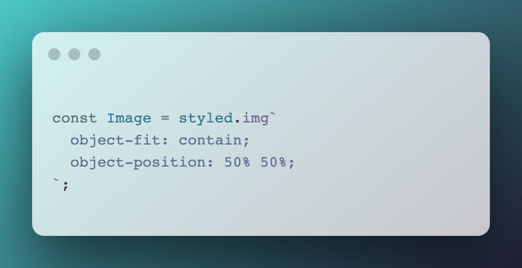
Starting with our <Image /> component, it's pretty straightforward. We use minimal styling. For our example, the image is setting the size of our parent container. This behavior can be over-written by giving the parent an explicit size
Next, we move on to our <Title /> component. This is where the flexibility really comes through. Let's walk through what's happening below. place-self: ${(props) => props.place} will allow our <Title /> to position itself anywhere inside of it's parent container via props. You'll notice that <Title place="start">Classic Margarita</Title> passes in "Start" via props. Styled components allow us to take our props and pass them into our styles.
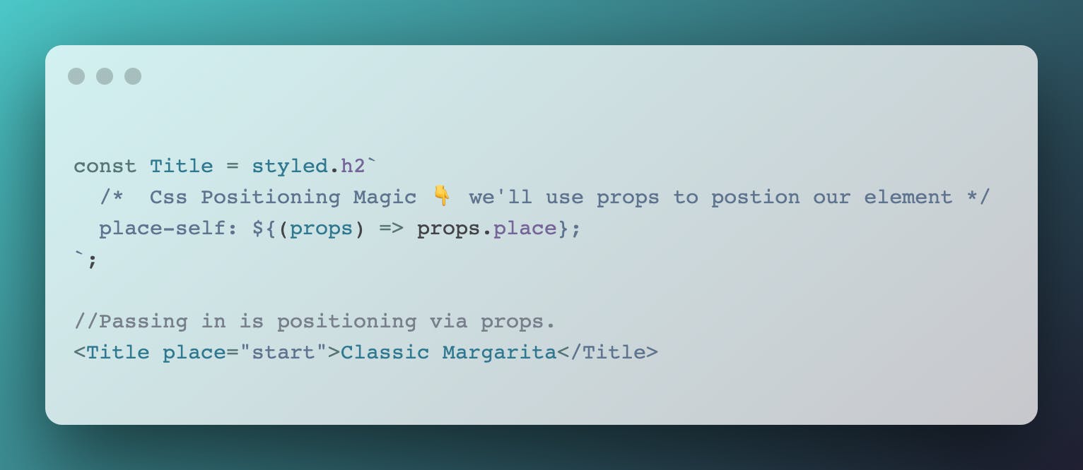
A few things to note, if you don't pass any props to our styles, <Title /> will be centered in the parent container. Also, place-self is shorthand for align-self & justify-self. place-self expects two arguments, but if they are both the same, (in our case start) the grid algorithm sorts it out for you.
Lastly, our <Recipe /> component. This component works exactly as our <Title /> component. We send its position via props.
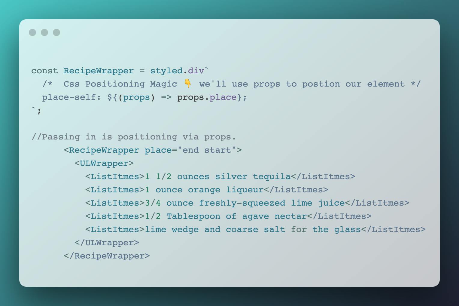
To see the code in action head over to the code-sandbox and play around with it. Try changing the position of each component via props. The CSS Grid commands are as follows: start end center.
You can use this methodology in many different ways, you can layout a page header, hear images, etc.
Made with love and tech, Ariel

